Market Sentiment Votes with its Wallet
Despite Q4 earnings data feeling like it just finished flowing in, here we are staring into the teeth of the Q1 2017 corporate earnings season that started this week.
And we’ve repeatedly covered how analysts low-ball expectations in order to report better than expected results. This is likely to begin afresh now.
Let's take a look at the hard numbers according to Thomson Reuters I/B/E/S data:
- The forward 4-quarter estimate is now $135.14, with the quarterly roll (a record)
- PE ratio: 17.4(x)
- PEG ratio: 2.10(x)
- S&P 500 earnings yield: 5.74% vs last week's 5.54%
- Year-over-year growth of the forward estimate: Fell back to +8.3% with the quarterly bump vs the +8.96% (multi-year high) from two weeks ago.
Note the earnings yield for stocks (above) where the 10-year is back into the 2.3% zone.
That’s quite a risk premium and still showing signs of significant investor fear related to stocks.
Financials will kick off the earnings parade this week, followed by airlines later in the week, which play a critical role in the Transport Index.
Note the semiconductor group has been a real leader, but also note summer is often a time of "digestion" in the sector. So, don't be surprised to see a pause after big runs; even with outsized earnings reports.
The Bigger Picture
Thomson Reuters is looking for 10% S&P 500 earnings growth for Q1 2017. Factset on the other hand, using slightly different variations, is looking for 8% growth.
Now, the historical pattern for S&P 500 earnings is that "actual" reported earnings tend to exceed "estimated, expected" S&P 500 earnings growth by about 4%.
As such, with Thomson expecting a 10% S&P 500 earnings growth at the start of the quarter, the historical pattern would suggest "actual" growth would come in between 13% and 14%.
Likewise, with the Factset projection of 8% estimated S&P 500 earnings growth for Q1 would hint at something closer to 11% or 12%.
If you put this all together for a blended average, the Thomson and Factset's "expected" Q1 earnings growth would be about 9%, as of this weekend.
Adding in the assumption that we see the 3%-5% "surprise" upside seen every quarter, and then once all the dust settles, we could see growth between 12% and 14%.
Sounds solid, eh? It is. And it’s especially so in light of the sentiment data noted below for you.
Just remember that the comp's are pretty easy given the ugliness of Q1 2016, which heralded in the current lows in crude oil and (most of the) commodity price cycle.
Speaking of Sentiment
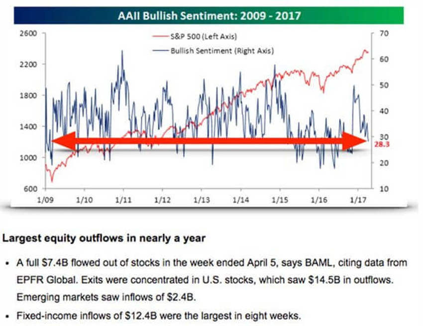
In case you missed it late week, note the fall into the 20's for the percentage of AAII respondents who are bullish.
In light of the notes above, and the 10-year fall back toward pre-election lows in the 2.3% range, we can easily see that fear remains quite stationary in the minds of the investor herd.


The charts above are separated by an interesting note that I’ve pasted in for you.
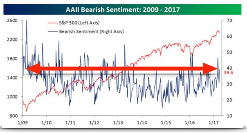
The middle item is certainly supported by the two charts above and below it.
And I’ve included a giant red arrow on each chart to help you see just how rare these reading are, and how they relate to where we were back in March of 2009.
The red line on each of the sentiment charts is the S&P 500.
Note that the blue line makes up over 400 weekly readings since the lows of 2009. Well over 95% of those readings are above where we ended last week, while markets chop around a few percentage points below their all-time highs.
This is incredibly positive given the contrary nature of sentiment.
In fact, the sentiment readings today speak volumes about how much is being misunderstood in terms of opportunities ahead.
The crowd continues to show you their feelings by how they treat their money, and money continues to flood into bonds at even the slightest hint of a pause in stocks.
A Shout Out to GDP
How many times have we heard that our GDP stinks, moves too slow, is not accomplishing anything…?
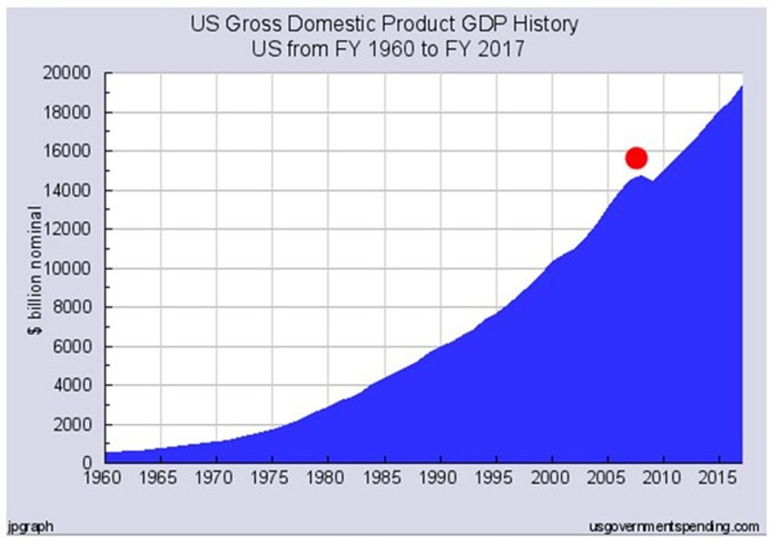
I saw this chart (below) and thought you might find it interesting. In all the hype it’s easy to overlook that there is only one pause in actual annual GDP output/growth over the last 50-odd years.
And yes, that was in the 2008-2009 event period.
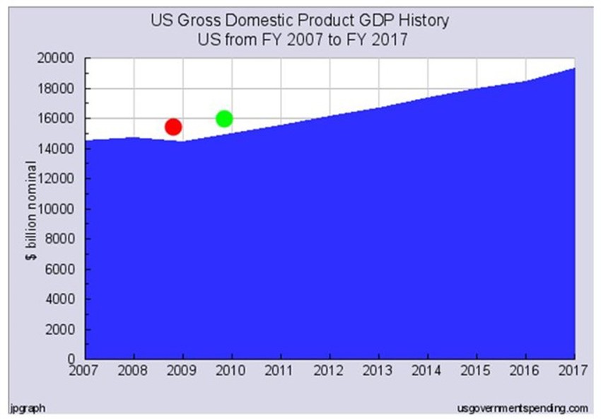
I’ve highlight that period for you in the second chart below the red dot.
The more important item is the green dot in the close-up second chart. It shows that the worst thing we can recall over the last 50 years took just one year for the economy to get back to record high GDP output!
Now looking at this in perspective, does this really appear like something that everyone should still be afraid of?


Back to the Future of Sentiment
In simplest terms, we’re back in the 20% range again for bulls, and almost in the 40% range for bears!
And we should look at this as good news - nearly 3 in 4 are afraid of the market again.
If lucky, earnings season chop could provide for an even lower reading than that.
Pray for that correction.
Be aware there will be a great deal of chatter in the media about the ongoing Trump troubles, the sell in May process and the summer haze that will be here before you know it.
Be prepared and use it to your advantage.
There is a glaring misunderstanding about just how positive these events are that continue to unfold under the surface.
As always, anything with a long-term positive slant demands patience, discipline and the ability to stay on your path while others fret over the headlines.
Remember: If we don’t see a correction over the next few months with all this negative market noise, Trumpageddon hysteria and reel-to-reel media head-fakes, then this market is far stronger than anyone realises.
