How a Black Swan Loses its Colour
Any US Federal Reserve chatter is good for a headline, regardless if it’s about action or inaction.
The latest and most popular angel seems to be that "we have entered no man's land for the markets" with a 70% likelihood prices will fall into the end of the month.
And you might see some merit in that perspective if you’re only studying statistics; a point we’ve made many times on these pages.
However, the deep-seeded fears amongst investors remain extremely strong. The nagging feeling that something must go wrong as stocks tip-toe around all-time highs has filtered through that entire audience.
In fact, even advisors are singing off that same hymn sheet now.
Check out the latest Investor's Intelligence data from Scott Grannis at the Calafia Beach Pundit:

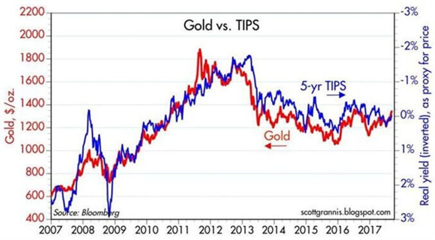
Now ask yourself how the prices of two pretty unique assets - gold and the 5-year TIPS - track each other so closely for the last decade?
The answer is “fear.”
TIPS and gold have long been recognised by the investor herd as safe havens in times of crisis - TIPS protect you from inflation and default, and we are likewise told that gold protects you from inflation and systemic collapse.
Now, the data tells us that although conditions are better than they were five years ago, investors are even now paying a heavy premium for that supposed safety."
Both of these assets have remained in the premium price category, clearly hinting that "risk aversion" is alive and well in the stock market today.
More?
Even as chatter is high that US Fed Reserve actions will pressure bonds, the global race for "safety" remains clear. We still have the highest yield of major economies by a wide margin, and that’s a good thing:

Sentiment?
While insiders have spent the last few weeks of August heavily building their positions on insider purchases, guess who is wilting under the assumption of a market collapse?
Advisors.
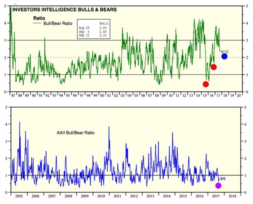
Let’s have a look at the advisor sentiment picture first and then investors in terms of the historic norms on reading of the Bull-to-Bear ratios for both:

These are great stats above from Dr Ed Yardeni.
I have highlighted in red dots on the first chart the readings back in early 2016 - the worst start to the markets in 85 years, right?
The next little dip after that were the fears surrounding the Election late last year. And then I’ve marked the present day in blue.
Here we are at the highs, and not after a correction, and the advisor audience feels about the way they did between late 1996 and 1998.
Ouch!
Now remember that these are ratios, and they show even more deep-seeded concerns versus just the outright weekly readings.
See the second chart above - the AAII Bull/Bear ratio. The purple dot gives you a sense of how low current readings are versus historical norms. The current ratio is lower than 95.5% of all previous readings.
Double ouch!
And as we round the corner of September keep in mind that this is a month with a history…just like every other month on the calendar.
The fears swing round and round. The calendar
And the more you know about them the less likely they seem to unfold as many fear.
Just like the way a Black Swan loses its colour the moment you start to talk about it.
